Case Study: Executive Visioning at AWS
At Amazon Web Services, the world’s largest cloud computing provider, I helped build a program that provides executives a forum to navigate complexity, align on their purpose, and think differently about the future. The program – Executive Visioning (EV) – became one of AWS leadership’s most effective tools for engaging customers in a differentiated way.
Drawing on 15 years of design and research experience, I helped create the following for the EV program:

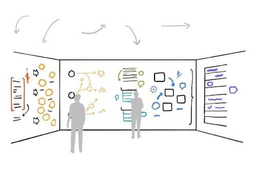
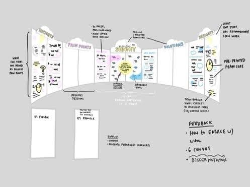
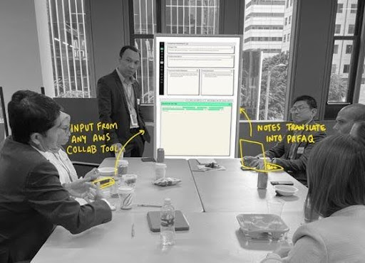
- Session design/delivery: I developed scalable workshop frameworks and agendas, using high judgment to determine which topics, participants, and agenda items to include based on stakeholder needs. These sessions were designed to guide participants through the messy, uncomfortable work of strategic thinking toward breakthrough outcomes.
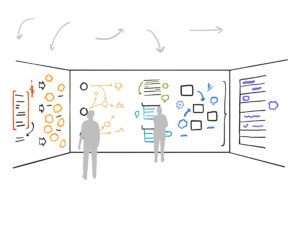
- Visual thinking components: I embedded visual thinking tools that transformed abstract strategic concepts into tangible, actionable insights that everyone could see and understand.
- Research methodology: I developed an approach the team used to gather insights from executive stakeholders. By understanding who’s in the room, what challenges they’re facing, and what they need to move forward, we were able to ensure each session was grounded in these important needs and context.
- Awareness/pipeline strategy: I created awareness from scratch and helped educate thousands of internal stakeholders on the value of the program and how to engage with it. This work ultimately cultivated a pipeline of high-value opportunities where we could strategically invest our resources.
Facilitated and illustrated hundreds of engagements with senior leaders from leading companies; to create moments of clarity and alignment during critical decision-making; structured yet flexible environments where executives can envision their future.


Case Study: Acronym
Acronym, a Political Action Committee, commissioned me to develop a series of illustrations that would cut through political noise and give voters real perspective on critical issues. By crafting visuals that highlighted contradictions and didn’t shy away from discomfort, I created illustrations that turned heads and (hopefully) changed minds.
The challenge was to cut through the noise of political discourse with visuals that would make people pause, think, and reconsider their assumptions. Rather than preaching to the converted, these illustrations were designed to create cognitive dissonance—highlighting contradictions in policy positions and forcing viewers to confront uncomfortable truths.
The illustrations were deployed across multiple channels to maximize reach and impact:


- Digital communications: Social media ads, email campaigns, and web banners that could be quickly shared and adapted for different platforms
- Print advertising: Full-page newspaper ads and magazine placements that commanded attention in traditional media
- Collateral materials: Postcards, flyers, and event materials that supporters could distribute at rallies, town halls, and community events

Each illustration was crafted to work independently while maintaining a cohesive visual language across the campaign. The approach balanced bold, attention-grabbing imagery with clear messaging that could be understood at a glance—essential for both the fast-scrolling digital environment and the brief moments of engagement with print materials.
The work generated significant engagement across platforms, sparking conversations and debates that extended well beyond the initial audience, demonstrating how strategic visual communication can reframe political narratives and challenge conventional thinking.
Case Study: NASA
Design Research & Strategy
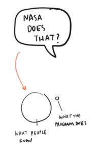
NASA’s Applied Sciences Program had a problem: Although it was doing incredible work – using satellite data to improve daily life on Earth, including food, water, air quality, and natural disaster response – most people didn’t know about it, let alone how to get involved.
Our challenge was to create a visual identity and more functional, intuitive ways to organize and distribute the Program’s data and resources, including through apps, web tools, and interactive approaches like AR and VR.
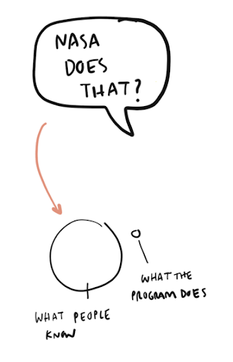
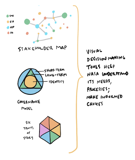
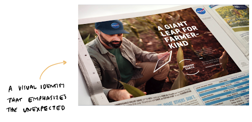
Our research helped us develop an identity that embraces the Program’s unexpected nature, embodied by unlikely industries and partners (like soybean farmers, pictured below). Additionally, discovery helped us create tools to guide NASA in its decision making and organization, such as a stakeholder map and communications governance model. The research resulted in a product roadmap for creating new tools to get its data into the hands of citizen scientists, chiefly a new website.
To find the right solution, my team designed and conducted a series of discovery exercises, including more than 30 user and stakeholder interviews around the country, aimed at helping NASA define and address its users’ needs through journey mapping, task prioritization, and content strategy exercises.
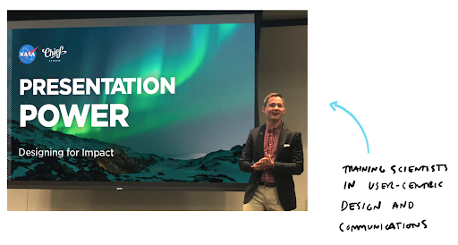
Throughout these discovery and design activities, my team also led NASA in trainings for design and user-centric communications.
Case Study: TechCamp
Design Research & Strategy
The State Department needed to overhaul the website for TechCamp, an exciting program that brings together bright minds from around the world for workshops that create solutions to urgent global challenges like urban sprawl and climate change. TechCamp wanted a website that could keep participants informed about upcoming events, showcase past events and the program’s lasting outcomes, and be easy to update as the Program’s impact evolved.
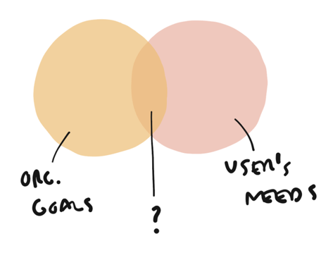
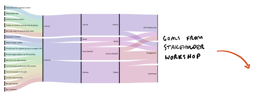
My team undertook in-depth discovery exercises, including user research with TechCamp’s globally distributed audience. Through workshops, interviews, and surveys, we were able to illuminate where TechCamp’s goals and its users’ needs intersect.
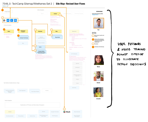
We started by developing personas that reflected the needs and behaviors of four “typical” TechCamp participants. Next, we conducted card sorting and content prioritization exercises with stakeholders to develop a sitemap that would meet both institutional and user needs. To demonstrate the latter to the client, we tracked each persona’s movement through the website, as illustrated here.
Following client approvals, we created wireframes and finally, developed a new
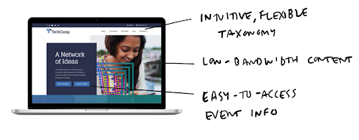
website with easy-to-access event information and a taxonomy that allows users to find relevant content by topic, geography and more. Throughout the design and development process, we focused on solutions that would meet the needs of a global audience — from color selection to event naming flexibility to low-bandwidth content.
The redesigned TechCamp website received an Honorable Mention at 2017’s International Competition for Marketing and Communications Professionals. Even more importantly, the new website positions TechCamp as a public sector innovator: As one test visitor put it, “Wait, that’s a government website? Cool!”
Case Study: A (GOOD) AMERICAN
Design Research, Strategy & Illustration
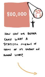
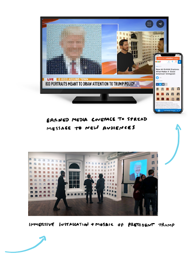
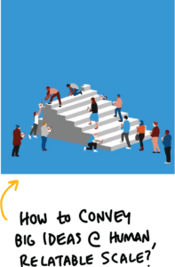
In 2017, 800,000 young undocumented immigrants were put into limbo by the Trump administration’s decision to end DACA. I wanted to find a way to bring proper attention to this urgent issue, but faced an obstacle: The way we consume numbers and statistics makes it impossible to grasp their human impact.
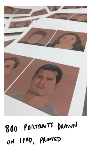
To reorient our relationship with this statistic, I drew 800 portraits of “dreamers” and created an installation that is part art, part data visualization. Separately, the portraits humanize the statistic; together, they form a mosaic of the president, posing larger questions about power and what makes a “good” American.
Over 1,000 people visited the installation over its six-week gallery showing in Washington, DC (just up the street from the White House). It drove powerful conversations in-person and online, and received favorable coverage on the local news and NPR.
Case Study: Consulting Firm
Strategy & Illustration
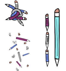
A top consulting firm approached me to create materials announcing their reorganized design team. The solution needed to convey the decision making process and the vision for how the new team would be integrated, while also easing concerns about change, all to an audience of discerning designers.
The firm originally asked only for design execution of predetermined content, but after further discussion, I convinced them to take a more strategic approach: A series of illustrations with a single narrative that would convey greater vision to the team.
I designed the illustrations to be usable individually across presentations, emails, websites, and print materials, but also to work as a single visual language unified by a common element: The pencil, deconstructed, then recreated and re-envisioned as something new. Together, the series brings to life the change process and works as a metaphor for the role design will play in the company.
The series was well-received by the designers and has been used across company materials related to this announcement
Portfolio
AWS Executive Visioning | Strategy and Workshop Delivery
At Amazon Web Services, the world’s largest cloud computing provider, I helped build a program that provides executives a forum to navigate complexity, align on their purpose, and think differently about the future. The program – Executive Visioning (EV) – became one of AWS’ most effective tools for engaging executives in a differentiated way.
Drawing on 15 years of design and research experience, I helped create the following for the EV program:
- Session design/delivery: I developed scalable workshop frameworks and agendas, using high judgment to determine which topics, participants, and agenda items to include based on stakeholder needs. These sessions were designed to guide participants through the messy, uncomfortable work of strategic thinking toward breakthrough outcomes.
- Visual thinking components: I embedded visual thinking tools that transformed abstract strategic concepts into tangible, actionable insights that everyone could see and understand.
- Research methodology: I developed an approach the team used to gather insights from executive stakeholders. By understanding who’s in the room, what challenges they’re facing, and what they need to move forward, we were able to ensure each session was grounded in these important needs and context.
- Awareness/pipeline strategy: I created awareness from scratch and helped educate thousands of internal stakeholders on the value of the program and how to engage with it. This work ultimately cultivated a pipeline of high-value opportunities where we could strategically invest our resources.

Design Direction & Illustration: Acronym
Acronym, a Political Action Committee, commissioned me to develop a series of illustrations that would cut through political noise and give voters real perspective on critical issues. By crafting visuals that highlighted contradictions and didn’t shy away from discomfort, I created illustrations that turned heads and (hopefully) changed minds.
The challenge was to cut through the noise of political discourse with visuals that would make people pause, think, and reconsider their assumptions. Rather than preaching to the converted, these illustrations were designed to create cognitive dissonance—highlighting contradictions in policy positions and forcing viewers to confront uncomfortable truths.
The illustrations were deployed across multiple channels to maximize reach and impact:
- Digital communications: Social media ads, email campaigns, and web banners that could be quickly shared and adapted for different platforms
- Print advertising: Full-page newspaper ads and magazine placements that commanded attention in traditional media
- Collateral materials: Postcards, flyers, and event materials that supporters could distribute at rallies, town halls, and community events
Each illustration was crafted to work independently while maintaining a cohesive visual language across the campaign. The approach balanced bold, attention-grabbing imagery with clear messaging that could be understood at a glance—essential for both the fast-scrolling digital environment and the brief moments of engagement with print materials.
The work generated significant engagement across platforms, sparking conversations and debates that extended well beyond the initial audience, demonstrating how strategic visual communication can reframe political narratives and challenge conventional thinking.
Design Research & Strategy: NASA
NASA’s Applied Sciences Program had a problem: Although it was doing incredible work – using satellite data to improve daily life on Earth, including food, water, air quality, and natural disaster response – most people didn’t know about it, or how to get involved.
Our challenge was to create a visual identity and more functional, intuitive ways to organize and distribute the Program’s data and resources, including through apps, web tools, and interactive approaches like AR and VR.
To find the right solution, my team designed and conducted a series of discovery exercises, including more than 30 user and stakeholder interviews around the country, aimed at helping NASA define and address its users’ needs through journey mapping, task prioritization, and content strategy exercises.
Our research helped us develop an identity that embraces the Program’s unexpected nature, embodied by unlikely industries and partners (like soybean farmers, pictured below). Additionally, discovery helped us create tools to guide NASA in its decision making and organization, such as a stakeholder map and communications governance model. The research resulted in a product roadmap for creating new tools to get its data into the hands of citizen scientists, chiefly a new website.
Throughout these discovery and design activities, my team also led NASA in trainings for design and user-centric communications.